
We often hear about how much or how little two measures correlate. In general, correlate means “When one goes up, the other goes up (positive correlation),” or “When one goes up, the other goes down (negative correlation).” There is a formula. I’ll break it into two parts (covariance and correlation) so it will make more sense as we go along:
\[cov(X, Y) = \displaystyle\sum_{i=1}^N\frac{(x_i-\bar{x})(y_i-\bar{y})}{N}\]
\[corr(X, Y) = \frac{cov(X, Y)}{\sigma X \sigma Y}\]
I’ll break that down more later. For now, \(X\) and \(Y\) are lists of measurements, \(\bar{x}\) is the arithmetic mean (average) of all values in \(X\), and \(\sigma X\) is the standard deviation of X.
The formula doesn’t quite answer “When one goes up, does the other go up?” What it actually answers is “How well do two sets of measurements form a straight line?”
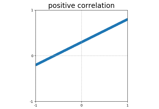 |
Points that form a line sloping up have a positive correlation (corr = 1). |
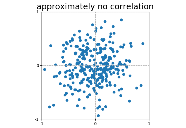 |
Scattered plots that do not form a line have, in general, no correlation. This particular random noise has a correlation (corr = 0.03). |
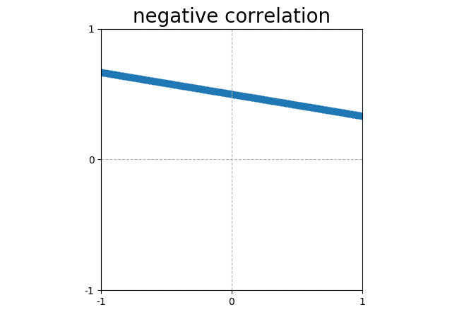 |
Points that form a line sloping down have a negative correlation (corr = -1). |
Those lines above look a lot like “When one goes up, the other goes up,” but that only works when “the other” goes up linearly. That is \(y = mx\).
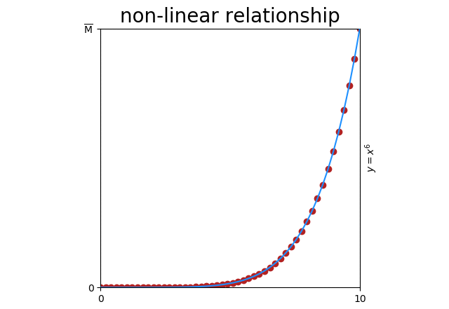
Even simple relationships can be non-linear. Here’s \(y = x^6\)
Obviously there’s a relationship (\(y = x^6\)), but correlation is only \(corr = 0.78\) because the relationship is not linear.
And forget about ever seeing that 78%. This is an impossible scenario with an even distribution of points and no noise. If you did see 78%, it would be non-informative anyway for the reasons that follow.
Asymmetry
Let’s go back now and have a closer look at our formula. The denominator (\(\sigma X \sigma Y\)) only scales the result to [-1 … 1]. The action happens in the numerator.
\[cov(X, Y) = \displaystyle\sum_{i=1}^N\frac{(x_i-\bar{x})(y_i-\bar{y})}{N}\]
In plain English, this reads:
For every pair of values in \(X\) and \(Y\):
subtract the average of \(X\)(\(\bar{x}\)) from the value of \(X\)(\(x_i\)).
subtract the average of \(Y\)(\(\bar{y}\)) from the value of \(Y\)(\(y_i\)).
multiply these together
Take the average of these results.
Trying out a few value pairs, we can see a pattern.
| \(x_i\) > \(\bar{x}\) and \(y_i\) > \(\bar{y}\) | ⇧ covariance increases ⇧ |
| \(x_i\) < \(\bar{x}\) and \(y_i\) < \(\bar{y}\) | ⇧ covariance increases ⇧ |
| \(x_i\) < \(\bar{x}\) and \(y_i\) > \(\bar{y}\) | ⇩ covariance decreases ⇩ |
| \(x_i\) > \(\bar{x}\) and \(y_i\) < \(\bar{y}\) | ⇩ covariance decreases ⇩ |
The \(y = x^6\) graph above doesn’t only suffer from non-linearity, it suffers from asymmetry. When I say asymmetry here, I mean that the mean (\(\bar{x}\) and \(\bar{y}\) in our formula) divides the points unevenly.
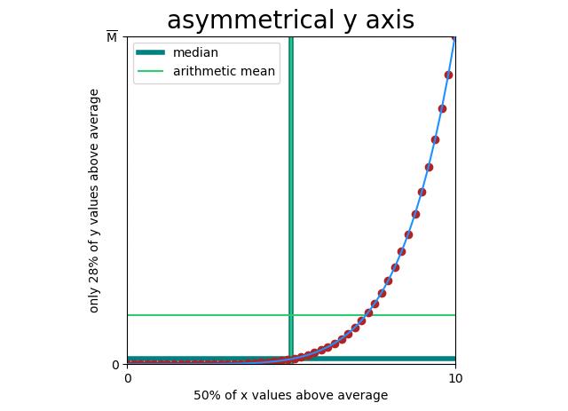
This breaks covariance, because covariance doesn’t actually measure “Does y increase when x increases?” it only measures “Is y above average when x is above average (and by how much)?” And when covariance is broken, our correlation function is broken.
Every comparison of gaussian (biological) and fat-tailed (economic) measures will fit this pattern, so every correlation between these two will be meaningless.
It gets so much worse
You can have a straight line, and still have asymmetry. Here x = y, but x and y are sampled from one side of a bell curve (so points will cluster around <0, 0>).
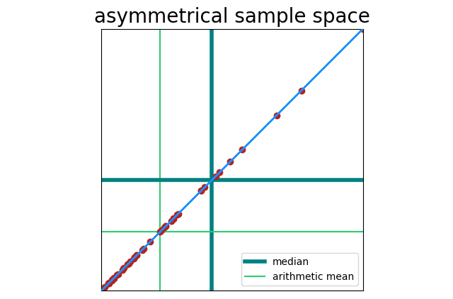
Correlation here is still 100%, but our sample space is asymmetrical. That becomes a problem when noise is present.
This leads to the next situation I’ll describe.
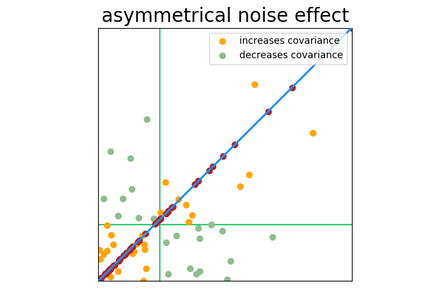
The Dead Hamster Problem
A group of researchers seek to find a correlation between the time a hamster spends running on his wheel and the amount of food he consumes. One problem: 200 of the 1000 hamsters in the study have died.
As the measures are taken, there is no correlation between wheel running and food consumption in living hamsters (our data is therefore 80% noise), but the dead hamsters are perfectly correlated (no running, no food) and that correlation is far away from the center of the sample space. Marking and coloring the chart as we have been, you can see what happens.
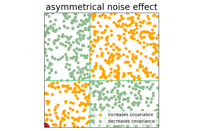
The hamsters don’t have to be quite dead to see this effect. Look for pre-filtered samples or sub samples: “tall males,” “light to moderate drinkers,” or “athletes.” This pre-filtering will sample from one portion of the bell curve and produce an asymmetrical sample space.
The interpretation of correlation is itself not linear (part 1)
In the images above, “data” (signal) is one color, and “noise” is another. This arguably makes the images easier to understand, but our formula does not see a difference between signal and noise. Points are points, and every point can increase or decrease what appears to be signal.
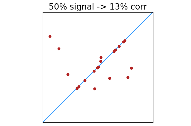
|
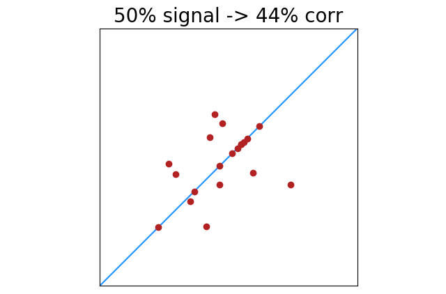
|
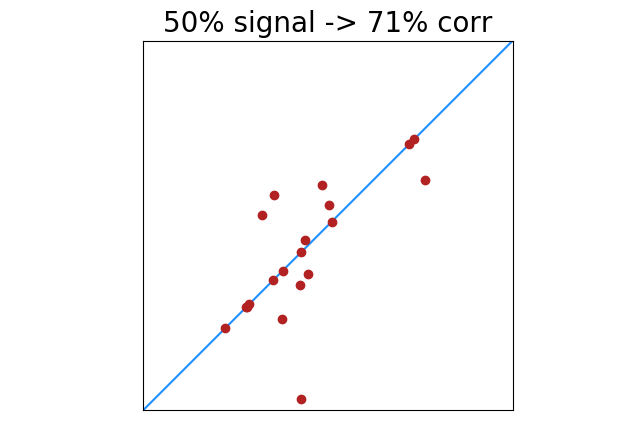
|
There is less of this of course as signal increases. 100% perfectly correlated points will always return 100% correlation. Lower percentages of perfectly correlated points will have greater deviation from noise. This shows the standard deviation of correlation results with x% of 20 points perfectly correlated.
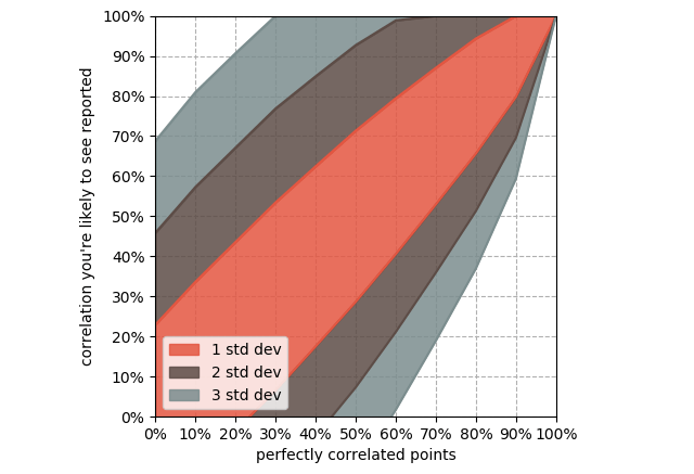
Deviation decreases with additional samples, but 20 is very common. Look for the word “average” as in “average by month”, “average by country”, “average by region”, etc. A billion samples averaged together into 12 buckets have the same symmetry, non-linearity, and noise problems as 12 single data points.
The interpretation of correlation is itself not linear (part 2)
Measurements above that show 50% correlation might feel like half of 100% correlation. Not even close. Here’s a chart full of made-up numbers, non-linear and (fwiw) obviously non-causal.
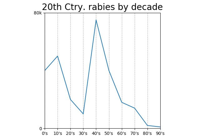
Correlation 56%! Why so high? Something else we can infer from our covariance formula: points farther from the mean have more weight.
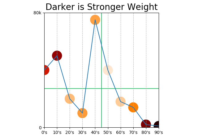
Does this mean that points at the beginning and end of the century count more than points in the middle? It does!
We should automatically dismiss any correlation “by decade” anyway. Correlation is between two measurements; decade is not a measurement, decade is a unit of measurement. “Decades under pressure” would be a measurement.
But, we can replace the “by decade” axis with something arbitrary that moved “by decade” in the 20th century: the popularity of polka music, number of households with cars, age of a particular tree, or percentage of households with electric light bulbs. Doing so would give us a chart between two actual measurements that might show a >50% correlation, but the correlation would of course be meaningless. 56% <<< 100%.


